


Cover Story
Hangeul has already spread around the world through K-pop, food packaging and so on. And now it’s getting the artistic treatment, which is drawing even more global attention. This article introduces work by artists who offer original interpretations of the basic geometry of Hangeul—its lines, circles, triangles and squares.
K-팝, 식료품 포장, 드라마 등을 통해 세계로 퍼져나가고 있는 한글. 그런 한글이 이제는 예술과도 접목되어, 세계가 그 자체의 형태적 완성도를 주목하고 있다. 수직선, 평행선, 대각선, 원, 삼각형, 사각형으로 이뤄진 한글을 자기 방식대로 해석하고 발전시킨 사람들과 그들의 작품을 소개한다.
Writer. Sung Ji Yeon
Astride the World
Kang Ik-joong
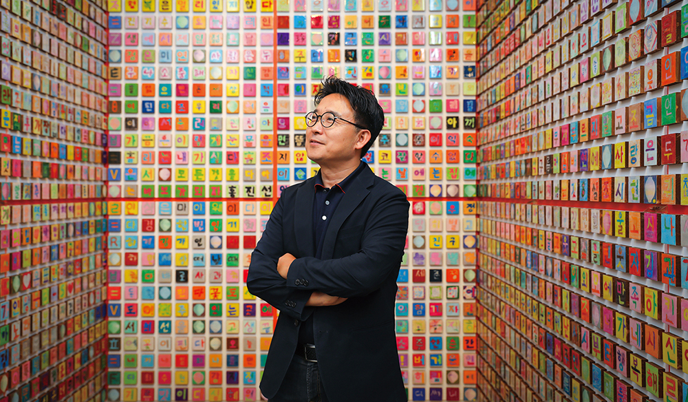
Kang Ik-joong is an artist who seeks to connect those alienated or separated by race and nationality. The cultural differences he perceived as a Korean studying art in New York inspired him to orient his work around connection and attraction. Hangeul is his main medium—its vowels and consonants rely on breath to produce sound, making it ideally suited for illustrating harmony.
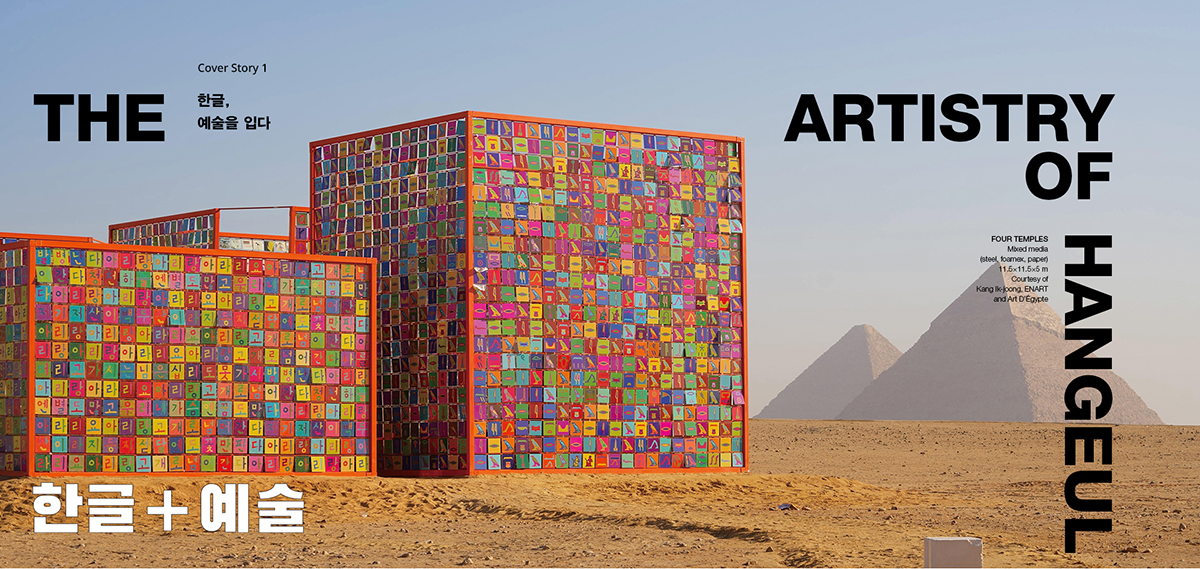
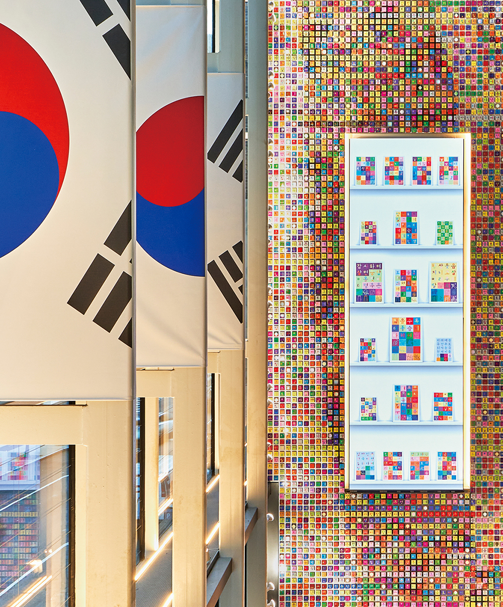
In Sept. 2024 Kang unveiled a 22-meter-high mosaic composed of square tiles inscribed with Hangeul—the world’s largest Hangeul-covered wall. Its consonants, vowels and backgrounds appear in a rainbow of colors like a field of wild-flowers. While Kang conceived the piece more than 8,000 collaborators from 50 countries submitted their favorite Korean phrases, of which he selected a thousand and colored them in his own style.
© Kang Ik-joong.
A wall typically separates spaces but Kang’s mosaic brings people together and fosters awareness of Korea. These phrases coalesced into universal themes of love, hope and connection, facilitating communion among artist, collaborators and viewers.
Kang became the first Korean invited to an international art festival at the Great Pyramid of Giza in Oct. 2024. He premiered “FOUR TEMPLES,” featuring four structures decorated in English, Korean, Arabic and hieroglyphics. Each structure’s exterior is engraved with the Korean folk song “Arirang” while its interior displays 5,016 paintings voicing people’s hopes and dreams worldwide—expressing humankind’s unity.
Kang Ik-joong has explored Hangeul as a medium for connection and self-expression, believing its flexibility and universal appeal can foster global communication. Through his art, Hangeul transcends cultural boundaries, spreading worldwide and linking people.
© Kang Ik-joong. Hangeul Wall: Things I Love to Talk About 2024, 20,000 Hangeul tiles (mixed media on wood: 3×3 inches each), approximately 8×22 cm
ADDING TEXTURE TO TEXT
Studio yang-jang
The type design studio “yang-jang” consists of two people: Yang Hui-jae, who designs Roman typefaces, and Jang Su-yeong, who designs Hangeul fonts. It’s not easy to make fonts from two different cultures that appear to have the same origin, but that’s exactly what these two designers are doing. Given the limited space available for Hangeul syllables, the typographer must consider the formal artistry of letters that vary with the presence or absence of a batchim (final consonant). Take 고 (go) and 곡 (gok)—the only difference is the batchim ㄱ at the bottom of 고, yet that changes the shape of both ㄱ and ㅗ. One Hangeul typeface must handle up to 11,000 possible syllabic combinations. By contrast, there are fewer than a hundred Roman letters, though their positions also demand careful attention.
Yang and Jang craft fine-tuned, streamlined fonts with distinctive character. Their first collaborative font, Penbatang resembles penmanship but avoids overly decorative flourishes. Subtle shifts in stroke pressure and direction bring vitality, allowing text to speak with one voice. Their fonts communicate information clearly while exuding elegance and personality. Try one of yang-jang’s fonts and you’ll immediately appreciate the beauty of Hangeul and the power of typographical design.
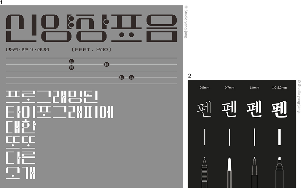
1. Shin-Yang-Jang Phonogram (2023), a new conceptual typeface that combines Hangeul with musical scales
2. Penbatang (2018), the first typeface by Studio yang-jang, reminiscent of the movement of a pen. Its charm lies in how its appeal varies depending on the thickness of the typeface.
Becoming Objets D’art
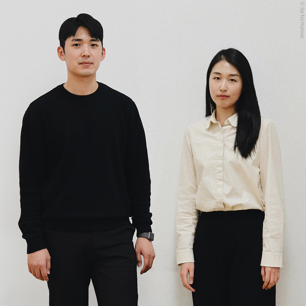
be formative
Hangeul possesses extraordinary formal beauty, composed of straight and curved lines with outstanding balance and symmetry, allowing for diverse artistic interpretations. The team “be formative,” led by designers Kim Yejin and Lee Kiyong, explores Hangeul’s potential in products that bridge the past and present, integrating its cultural significance into modern lifestyles. To make Hangeul more approachable, they’ve brought its letters into three-dimensional space.
© be formative.
One product, the Hangeul Balancer, highlights the geometric elements of Hangeul consonants ㅊ(ch), ㅍ (p) and ㅎ (h) arranged in three dimensions. It serves an educational purpose and doubles as a decorative object with its sleek wooden texture. Another creation, the Hangeul Marble, draws on the principle of forming new letters by adding strokes (e.g., ㅡ to ㄱ, ㄴ and ㄷ). The game involves guiding a marble through each letter’s path.
Though Hangeul’s beauty and simplicity are remarkable, it remains inaccessible to many outside Korea. By embracing its artistry and unique design, we might find ourselves enchanted—just as the designers at be formative have.
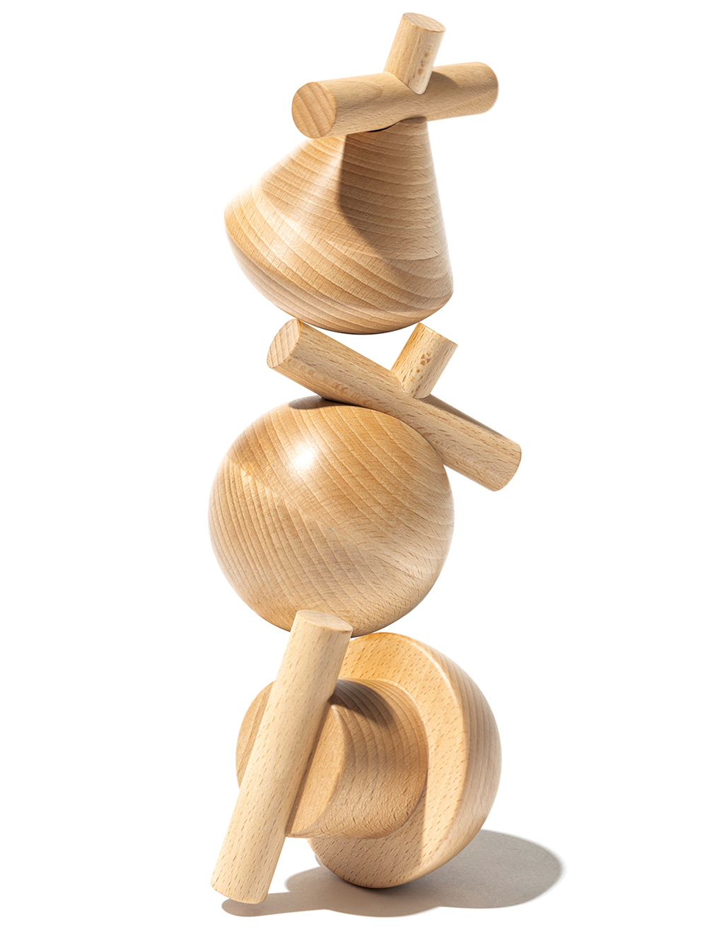
ⓒ be formative. Hangeul Balancer, wood, 2022, support form Korea Institute of Design Promotion (KIDP)